Sunday, 30 March 2014

SEPHORA SALE! A Recent Haul & My Recommendations...

It's that time again! Starting today, Sephora is offering up 15% off of your ENTIRE purchase to VIB Rouge members! If you're not sure if you're a Rouge member, it may be worth it to check your account! You may have been upgraded without knowing.

So as always, I wanted to share with you guys some of my recommendations as well as some new awesome items I picked up from there! Seriously, I've recently gotten SO many awesome things from there! This haul video is full of so many great new things as well as some of my definite must-have items from Sephora if you need any ideas of what to pick up during the sale.

I hope you guys enjoy the video, and happy shopping!!

Sale Details:
Shop here and save 15% off of your entire purchase March 30- April 11, 2014
MUST USE CODE "ROUGETICKET" AT CHECKOUT


My recommendations/what I picked up:


So who's shopping the sale today?? Tell me what you picked up or what you've got your eye on!!


post contains affiliate links

Friday, 28 March 2014

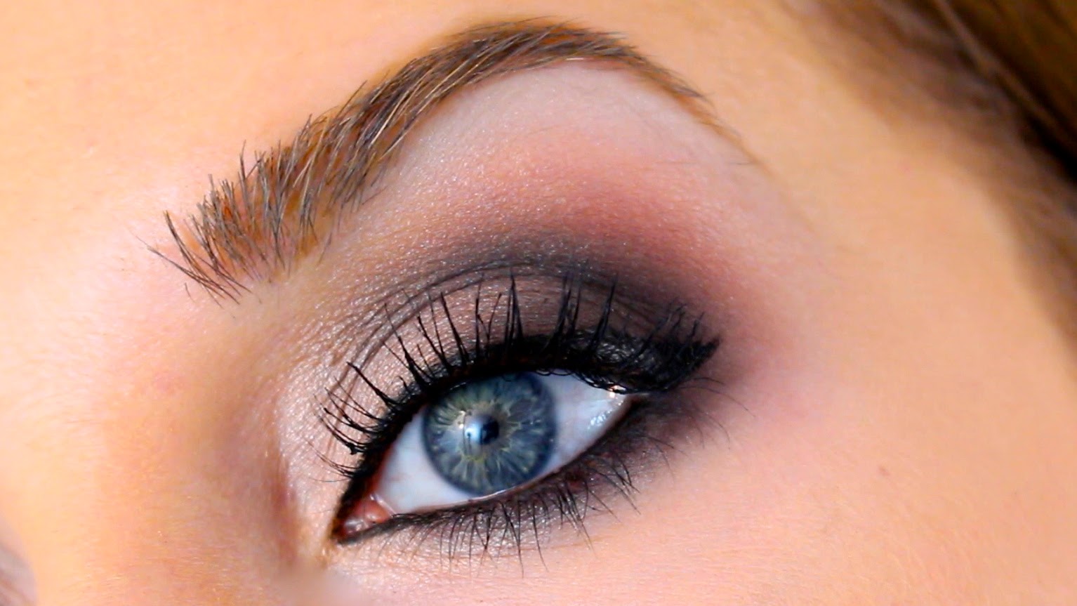
Eye Brightening Smokey Makeup Tutorial

Apparently this week I've been majorly in the mood to do tutorials... because today I'm back with another!  This one is unique in that it is a smokey eye that actually makes your eyes appear brighter and more awake.

While dark, smokey eyes are beautiful (and some of my favorites where makeup looks are concerned), they can be a bit enclosing.  At times, they can also make your eyes actually appear smaller.
So in this video, I'm going to show you how to avoid all that, while still keeping the beautiful dark and smokey intensity of the deep eye shadow colors and liners used.

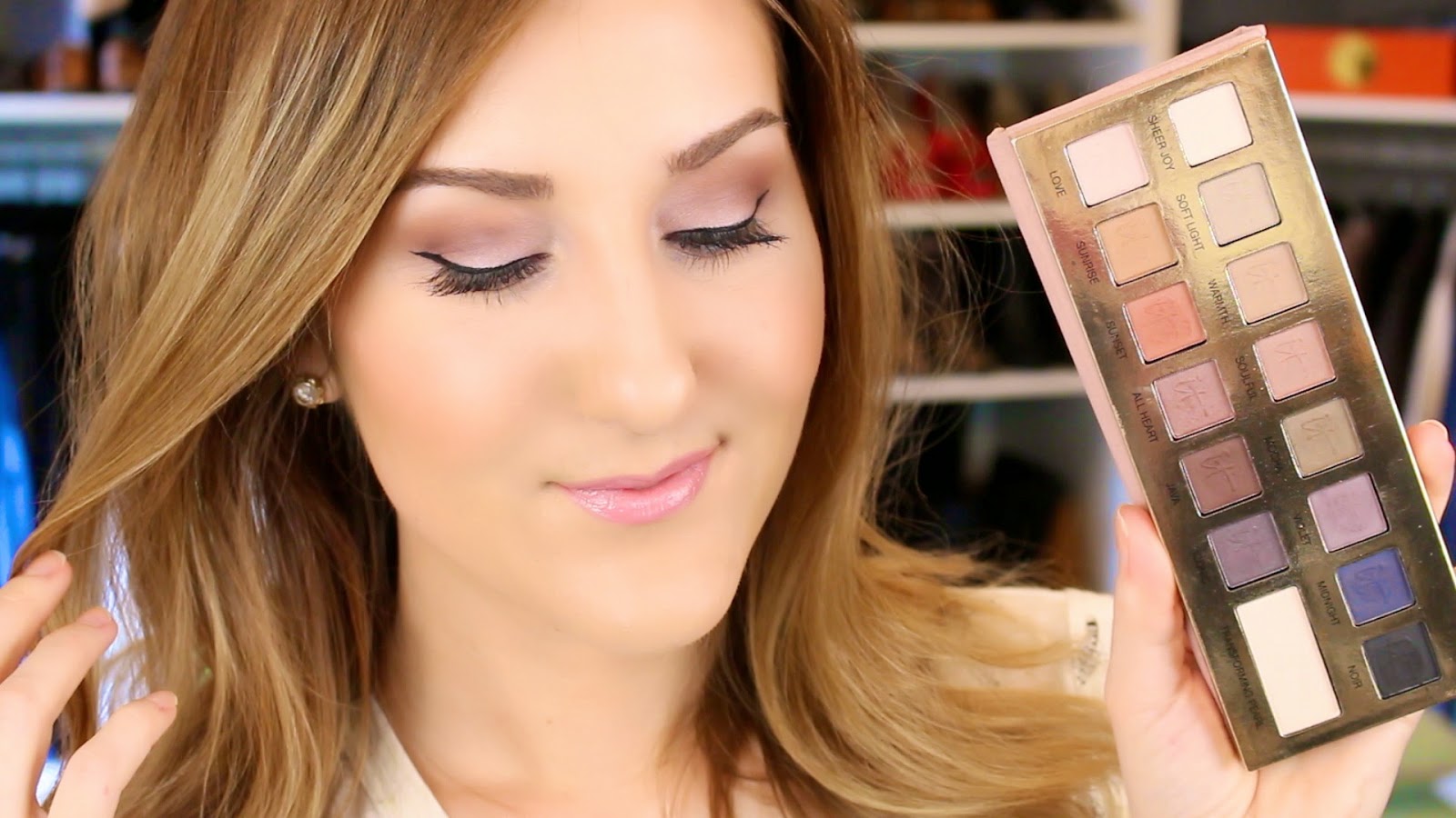
Oh, and I busted out my IT Cosmetics Naturally Pretty Vol.1 Matte (that's a mouthful) palette again!
If you missed the first tutorial using this palette earlier this week, check that out here and get all the details about the palette (swatches, etc.) in this recent post here.
It's seriously SO versatile.

So don't miss the video below for the full tutorial! I hope you all love it!!


Products Used:
Makeup brushes used: Save 10% off your entire Sigma Beauty purchase! Click HERE and enter code "TIFF10" at checkout
not shown:
foundation worn: IT CC cream 


post contains affiliate links

Wednesday, 26 March 2014

IT Cosmetics Naturally Pretty Vol. 1 MATTE Palette Swatches/Review

I totally realize I've been gushing like crazy about this palette lately, so this is definitely not going to be one of those review posts where you're waiting for my definitive verdict.  
There is no mystery here... We all know I'm sort of obsessed with this one.

But I wanted to accompany my latest tutorial video (a natural Spring look using this palette) with some more in-depth swatches and info on this palette, as promised.  In that video I gave a quick little overview at the beginning of the palette, but there is so much more about this palette that makes it unique.

So here we go. First off, the packaging...


Shown above is the box and outside of the palette itself. It's sort of a spongy, soft, fleshy-rose color. Not bad, not great, aesthetically. However, I really like the actual make-up of the palette. The actual way it's made. It's very similar to the way the first Naked palette is made with the large flap and magnetic closure along the front. It's very easy to get in and out of.

As far as the inside, it's gold and gorgeous...


The palette consists of fifteen shades total. Fourteen of those are actual colors, ranging from more natural tones (highlight colors, tans, browns, and light gray-taupes), as well as some more rose-y mauves, a sunny coral, purples, a navy blue, and a jet black.  All of these shades are labeled as being "matte", however they are so much more. They aren't a typical flat, chalky matte at all. They are my absolute favorite type of matte... almost with a bit of a satin-y sheen. Just enough to keep them from looking chalky on the lid. They definitely still appear matte on the lids, but they have a more natural finish. They are smooth, buttery, and almost creamy (they are definitely a powder), in that they apply so smoothly.  They all blend together like a dream (even the darker shades) to create that glowing and beautiful, blended eye effect. Like I said in my recent video, they basically blend themselves.

What makes this so palette unique (other than the quality) is that larger shade in the lower right corner of the palette. This "transforming pearl" shade is made to layer over the shades to almost create fourteen entirely new pearlescent, shimmery shades.

Here's a better look...


Here's a swatch of all the shades applied straight from the palette, without the transforming pearl shade over them.

taken in the sunlight, without the transforming pearl

taken in natural light (not direct sunlight)

And here they are with the transforming pearl blended over them...


Pretty right??

So aside from all the great things I've already said, it gets better. The actual formula is anti-aging! It has ingredients that actually make your lids appear younger and smoother. Very unique for a powder eye shadow.

Here's the description from IT Cosmetics:

"Includes Hydrating Age Reverse and Prevent Complex and infused with Peptides, Hydrolyzed Collagen, Silk, Anti-Oxidants and Drops of Light Technology. Paraben-free, fragrance-free, sulfate-free, cruelty free.


...All shades can be used wet or dry as shadows or liners and are designed to make your lids look younger with lid-loving ingredients including Peptides, Hydrolyzed Collagen, Acai, Green Tea, Silk and antioxidants!

These luxe, anti-aging shadows were developed with plastic surgeons to instantly diffuse the look of lines and wrinkles on the eyes and lids."


Pretty cool, huh?

The palette is available at Ulta.com (and in stores as well) for $42.


If you missed my latest video about this, check it out here to see the palette in action! I can't wait to do more looks with this one!  Maybe even later this week... ;)
*I've also added ANOTHER tutorial! Check out the latest one here (Brightening Smokey Eye).

So what do you all think? Have you tried this one??

post contains affiliate links


Tuesday, 25 March 2014

Fresh Spring Makeup Tutorial

I'm SO in love with the IT Cosmetics Naturally Pretty palette.  The colors, the quality... everything. I've been using it pretty much exclusively since I got it a few weeks back and I can honestly say the quality is unmatched to ANYTHING else I own. I know that's a pretty big statement, but seriously the shades seem to blend themselves.
I'm also obsessed with the actual colors. There are so many possibilities with this one. I love how they included a nice mix of more natural shades as well as some purple, coral, and blue.  All while keeping the shades incredibly pigmented, yet wearable.
This isn't really going to be a huge post reviewing the palette itself (look for a swatch post here on Thursday), however I do give a little overview/review at the beginning of the video below before the tutorial.

For this look, I wanted to create a sort of "wear anywhere" Spring look.  I kept with my favorite actual eye shadow placement that works for any look really, while using colors other than the typical browns.

Fluttery, natural lashes, clean liner, and a a pretty blend of brightening mauves and purples on the lid paired with baby pink lips and a glow of peach on the cheek all come together to create a really bright-eyed, put-together look that is also a bit fun for Spring.  I hope you enjoy it!


Products Used:

Makeup brushes used: Save 10% off your entire Sigma Beauty purchase! Click here and enter code "TIFF10" at checkout


post contains affiliate links

Monday, 24 March 2014

Target end tables LOVE gold spray paint.

This weekend I hit the Target end table jackpot for my office. Seriously.  
You know how I always say what a big change a little paint can make (in a room)? Well the same is to say with furniture.


Before I get ahead of myself, this change all started with a printer.
Yes, a printer.

Our printer had been acting up for a very long time. For months we had been wanting to upgrade to a new fancy shmancy wireless one that we could keep sitting out all the time. The desk area is in the photo above to the right, sort of behind that french door. We kept our old clunky one hidden in a cabinet and whenever we needed it, we would hook it up to whatever computer needed it. Suuuper handy... not.  
So when it totally stopped living last week, we decided it was time to upgrade.


Anyway, we picked up a Canon MG5520 one night at Target. Nothin' but great things to say about it so far. We knew we wanted to leave it out and ready to go all the time since it's wireless and all, but it was really large on the actual desk top. So I looked around the house for a small table we could set it up on. Turns out, the little end table in this room next to the couch worked just perfect.

So to replace it, I remembered a cute little mirrored table I saw at Target that same day when we were buying the printer. I remember thinking, "That's cute... if it were gold."  
So I printed out a $10 off of a $50 home purchase coupon on the new printer (See what I did there??) and scooted back over to Target for the table.


It's the Two-Tier Round Table in Antiqued Pewter.

Don't get me wrong...I don't mind pewter toned or silvery things, but for a table like this, I prefer gold all the way. Plus the finish on this one looked a little sponged-on which was weird.

When I got it home, Brad helped me tape-off the mirrors.


 My original plan was to pop out the mirrors (we have some similar tables in our family room with removable mirrors), but they didn't budge.  So it was Brad's idea to do it this way.  Kind of genius. My idea involved cutting round paper and... wasting a lot of time.  This worked SO well. He just taped the mirrors off and I cut around the mirror with a craft knife to remove the excess tape in the exact shape of the mirror.

Then she was ready to paint.


I use the Valspar Metallic spray paint in gold.  I've used other brands in the past for other crafty little projects and I find this one is the most realistic in tone.

I sprayed a few light coats until the color looked solid.  I then let it set outside on our back porch overnight to fully dry and to let off some of the fumes from the spray paint.  Then, I removed the tape.  I am SO happy with how it turned out!!


...So happy that I went back for a second.


Oh and check out Frankie my fig over there soaking up all that sun! We had some work done in our foyer a few weeks ago and had to move everything out of there while the work was being done (I'll post all about that soon).  I moved him in here as a temporary fix, but I think he may have to stay there! He gets a lot more sun here and isn't always getting brushed up against by people coming in and out of the door. So we'll see how it goes!

Anyway back to the tables..


After adding the first, it just felt like there was something missing from the other side. I love how balanced the second one made everything feel. 
Plus, these are PERFECT for this room because the second tier on the bottom allows for some extra decorative knick-knacks since there's not a lot of shelving or spaces to sit books on in here. I love the look of stacked books on that bottom tier.  


So that's it! My biggest tip when shopping is to look beyond the obvious. If you love the lines of a piece of furniture, accessory, fixture, etc... but hate the color, no big deal! You can always change it! Which I like even more because it makes it more unique and your own.

So any great Target finds to share lately??


post contains affiliate links

Friday, 21 March 2014

AFFORDABLE SPRING CLOTHING HAUL

I'm so not about buying an entire new wardrobe just to prepare for an upcoming season.
Spring always gets me though.

We make it through Fall and Winter and suddenly we're bombarded with all the fun, colorful fashion newness coming at us from everywhere.  So I chose a few key pieces for Spring... a bold skirt and some white denim, with some affordable basics thrown into the mix.

I also have a few pairs of new shoes to share since we're talking hauls.

I hope you guys enjoy it! Check out the video below for all the details!


Have you all picked up any new Spring fashion goodies??

post contains affiliate links

Wednesday, 19 March 2014

Some master bedroom details & decor ideas

There are a few areas of the house that haven't gotten much posting love on the blog. Our master bedroom is one of them.
Strange I haven't posted about it much because it's actually one of my favorite spaces.


It just makes me feel good.

When we moved in to our new house about a year ago, we kept all the same bedroom furniture, decor, bedding, etc.  I LOVE a comfortable white bedroom (with some contrast, of course). To me, it just feels more comfortable and calming, and I like the versatility. I hate limiting or defining a room with expensive items you can't easily change.

For example, bedding or a wall color. I like to splurge on nicer bedding (you use it everyday) in a neutral, so I can change up the whole feel of the room whenever I like with some pillows or a throw in a fun pattern or color. So I like to have one good bedding set that I like, rather than spending a fortune on a lot of colorful or patterned bedding to change out all the time.  Same thoughts with a wall color-- If the room was blue, what would happen when I wanted to go a different route with accessories? It can just be limiting in a larger space with a lot of accessories.


So for our bedroom I like light, bright, and a bit glam. I love how easily the whole feel of the room can change with the swap of some easy accessories.   


Propping some large mirrors up on the side tables is one of my favorite tricks to make a room look a bit larger and add some sparkle. These are the same ones we had for years at our last house (set up the exact same way) and they worked out perfectly here as well since there are no windows on that back wall behind the bed.

The space itself is a lot larger than the bedroom at our last house, but it's layout is exactly the same. Same window wall, same spot where the bathroom doorway and main doorways are.  So setting it up was a no-brainer.

I WISH I would've grabbed some before shots months ago, but this wall below was completely a mess the first 8 months or so that we had lived here.
Imagine it with no chairs, the same dresser, and a large, tall, chest of drawers over near the corner. We had the tv on top of the taller chest.


Gotta love the Beverly Hills Housewives. ;)

It felt like SO much furniture. So we moved the tall chest into the back of Brad's closet since it's plenty big enough, and the chest is full of Brad's stuff anyway. So it being in his closet makes sense and freed up a ton of space in here.

Turns out we love the tv on the dresser so much better.  Before the bedroom-tv-police cite me, we're bedroom tv people and we love it. We don't sleep with it on or anything, but to me, there's nothing better than relaxing in bed with a movie every now and then. I've never understood the bedroom tv hate. I mean, you can turn it off whenever you want. It doesn't control itself...haha.  
Like I always say, you should make your space into what feels good for you. That's the fun of decorating!

Another big change is the addition of these two chairs...


I love to have at least one area to sit in a bedroom that isn't the bed. I got these chairs from Target last year to go in our family room.  I didn't 'really love the color in there, so we moved them up here and they work perfectly. *They still have them and they're actually on sale now!

Here's a shot from the other direction...


We thought of adding a fun chandelier since the ceiling in here is so beautiful, but I don't think we could live without a ceiling fan in here.  Granted, it is a boob ceiling fan, so I may have to re-work that somehow in the future. ;)
Not such a big deal because we added the pretty chandelier in the bathroom which is closeby.


For more on the bathroom, check out this post.

Between the windows I recently added my preserved wedding bouquet. I posted a photo of it  a while back and got a ton of questions about it- Basically it's freeze-dried. There are a ton of places that preserve bouquets like this. You just get the flowers to them within a few days of the wedding and you'll have them to keep forever.


The little mirrors came in a set of three from Target.

As for the pillows...


The green ones are the same custom ones that I had specially made from fabric I chose.  Same idea with the spotted one in the middle (it's from Etsy). You may remember them from this recent post.  I've moved them around a million times since I got them (they look good everywhere), but I especially love the print mixed with the leafy green in the other pillows.
The little round black and white bolster is from Target (it's over 5 years old).

So that's it for this space for now! Just wanted to share a bit of the changes we had made in here that made such a huge difference and show you what I've done with this space so far! What are your favorite stores to find unique pillows??

reference:
paint color: Sherwin Williams China Doll
chairs: Target
pillow: Etsy
bedspread: Macy's (We've had ours for 3 years and it's held up great! Plus it's on sale now!)
"window" mirrors: Ballard outlet
sunburst mirror: Kirkland's
lamps: Target
set of 3 square mirrors: Target
"madame" & "monsieur" pillows: Ballard outlet
curtains: Half Price Drapes


post contains affiliate links

Tuesday, 18 March 2014

New makeup goodies...

If you follow my videos over on my YouTube channel (you totally should, btw... I don't always post them here), you've probably heard me mention (since February) a big haul that was coming up.

...and you were probably all like, Tiff, get on that already.

So I finally filmed this collective haul that turned out to be even larger than I thought it would be. Typically, when I film hauls, they're from one shopping trip. Well, this one includes things I've picked up here and there since mid-February. I've literally been collecting this stuff in a shoebox on my vanity so I wouldn't forget to show anything...haha.

Anyway, I feel like this one includes a TON of awesome things and I cannot wait to share them with you all! Hope you enjoy it!


So have you guys tried any of these products?? Let me know what you think!!


Post contains affiliate links. Anastasia products provided for consideration with no agreements or obligations to feature.

Monday, 17 March 2014

My long "yummy" sweater.

We all have those few items of clothing that just feel yummy. Cozy, comforting... Like a security blanket.

This jacket is my grown-up security blanket.


It's just the right length for a longer jacket/sweater, without looking sloppy. It has the feel of a cozy sweater, but with the structure of a jacket. The material is just so soft and cozy too.

I like the "easy" look and feel of this piece. I love that I can throw it on with the most casual of looks, but also slip it over a nicer dress (even worn over the shoulders).  It's just so versatile. I also love the texture it adds to any outfit.


Oh and I definitely slipped a new pair of Rockstuds in there as well. ;)


I got the lower heel version this time, and... wow.  While the higher version is crazy comfortable for a heel that high, these are insanely easy to walk in and just as comfortable as the other version.  I LOVE Rockstuds, can you tell?? I've put myself on a Rockstud ban after these though. 

Seriously. Hold me to that. 

jacket: ASOS
top: LNA (similar)
jeans: Express
shoes: Valentino
bag: J. Crew (similar)

I hope you all have an awesome week! Check back tomorrow for a brand new beauty video!

post contains affiliate links

Thursday, 13 March 2014

A Southern Blue Porch Ceiling...

Consider this sort of a "part 1" to our screened-in porch "freshening-up".  :)

When we first looked at this house one year ago, this brand new back porch was definitely one of our favorite features.


I cannot WAIT until everything greens up again and the trees fill in like that soon!

That shot was taken shortly after we moved in last Spring. We used all of the same patio furniture from our last house (from Target- It's held up SUPER well for 4 years), and a glass table that my parents gave to us that they didn't need.  We used all of the same cushions (more on that in a moment), little lanterns, etc.  The porch has pretty much looked exactly like that since the day we moved in.

Waylon loves it too...


See what I mean about the trees?? Not so pretty in the winter... :/
One of my favorite parts about it is the pretty bead board ceiling. I had always dreamed of painting it a pretty "haint" blue (very common on older historic homes in the south).  
To get an idea, check out these photos here, here, and here. ...and if you want more, Pinterest has got you covered.

There's a whole southern backstory to the whole "haint blue ceiling" thing, and it mostly involves warding off evil spirits and mosquitos. Basically those two are one and the same in the south. If you've ever lived through a Georgia summer, you know what I mean. ;)

I'm not at all superstitious, and I'm not sure I buy the whole thing about it keeping bugs away, but I'm just pretty much in love with the way they look. 

And so our porch ceiling went blue.


Let me just tell you, it is not easy to capture the color of this bad boy on camera. It's a lot brighter and clearer blue than these show.

I used "Atmospheric" by Sherwin Williams in a high gloss formula (which is also why it's a bit hard to capture the true color because it's so reflective and pretty).  In person, it matches closest to how this ceiling appears. I would guess that's the shade they used as well. My parents just recently painted their new porch ceiling this same shade and my mom said that this was the color most often used to paint blue porch ceilings with from the info that she had found.

It's bright and beautiful and mimics the color of the sky perfectly.


The actual painting was a bit difficult. I just hate painting ceilings, period. I actually used painter's tape for this one since we have pretty moulding around the actual ceiling. So I taped that off and covered everything (even most of the floor) with drop cloths.  I didn't do that so much for drips (because I'm used to painting with a roller), but because rollers inevitably leave tiny "splatter" marks on flooring that you may not even notice right away. Hundreds of them. So it's best to be safe!

Here is a shot from the other side. The natural-colored wicker furniture was left from the previous owners. Which worked out perfectly because it's a large space and it was nice not having to buy extra furniture to go with the stuff we already had...


...Which brings me to why I referred to the new ceiling as "part 1" to this redo.  The furniture is in awesome shape and is made quite nicely. However, they didn't have any cushions, so I added my pretty  outdoor pillows I already had and used some mismatched large cushions to sit on that I found at Homegoods and TJ Maxx. I may eventually change those, but I think they'll look much better when I repaint the furniture. Before the pollen starts to fall this year (or I may just wait until after so I can clean it really really well), I'm planning on spraying the natural-colored furniture the same dark color as the rest of the furniture out here. After I do that, they should match pretty darn closely and everything should look a bit fresher and more cohesive.


I've owned outdoor pillows from several places, but all of my black and white ones have held up beautifully.  For three years they baked in the sun on the back porch of our last house and they've held up nicely for one year here as well. They still look brand new with zero fading which is super impressive.

I've even used them indoors for years.  I had some extra lumbar pillows and one extra square pillow I had in the basement that I used in our family room at our old house years back. Not sure why I didn't put them back out in there after we moved. That was always my favorite look for our family room (the black and white), so I put them out again recently.  All of these outdoor pillows I've shown are from Ballard Designs.


I love the look of mixing different black and white patterns. I'll do a post on this space soon!


Anyway, I love how the striped pillows are soft to the touch (unlike most "outdoor" pillows), yet I know they're super durable enough to last forever. It also works better in here because the stripes aren't too bold or wide, and rather than being stark black and white, they're black and a sand color.

Overall, while this was tricky (SO glad we have no other ceilings that need to be painted...), I'm so glad I went ahead and did it.  I feel like it made our house just a bit more unique and special. 

I'll update you guys when I spruce up the furniture out there.  I also want to maybe pick up a few ferns as Spring draws closer.

So do any of you guys have blue porch ceilings? What do you think about them?