At our last house, one of my favorite things about it were the built-in "bookshelves" in the family room.
I had to do some serious digging (on my iPhone) to find this one, but here's the best shot of those I could find (well one of them at least...just imagine the other one on the right).
This shot probably doesn't do them justice, but they were HUGE. Like 3 feet deep. Ok maybe not that much, but you feel me. Definitely too large for just books. I had so much fun decorating those, but I could never quite seem to get them right. I was constantly "shuffling" everything around.
So fast forward to the new house hunt early last year. I knew that built-ins in the family room were a must-have for the new house wish list for me. I just love a good set of built-ins in a family room. Not just for books, but for storage (check out all the cabinet space beneath them), and displaying random tchotchkes.
I love me some random tchotchkes.
While iPhone-digging for that last photo, I also came across this one on moving day into the new house last year...
Total chaos.
The first place I decorated in the house was literally the bookcase area. I really love ours. They aren't as deep as the last ones, but they are much taller with one more shelf and some recessed lighting.
Funny enough, I haven't majorly changed anything in them since. Because I'm really happy with how they turned out, I think I can *hopefully* provide some basic bookcase styling tips that may help you out if you're stumped!
Just for some reference as to how big these are (because photos make them look deceivingly smaller than they are), when I'm standing in front of them, my head comes right to the top of the second shelf (I'm 5'7"). Also, the paneling is right at 11' tall. You can see where it ends better in the photo above.
Here's a better shot of them...
That's why decorating shelves like this is difficult. Unless you own a small library, you're not going to be able to fill up large shelves like this with actual books. Plus I like the look of some interesting things on shelves mixed with the books as well. Problem is, when you add a lot of random things it can begin to look as chaotic as the moving day photo above.
Because I have a good bit on the actual shelves, I like to keep the mantle really simple. Sometimes, I go around and "de-clutter" and remove everything from the mantle completely. But that's another post for another day.
Funny because I remember in a decor post a while back, someone commented that they found it funny that we had no books on our bookshelves. I counted. There are 34 (not including the little fake white ceramic ones and magazines, of course). Some are hidden around the corners of the shelves. There's just a whole lotta' shelf. You can see that a bit better below.
So let's just get down to my tips...
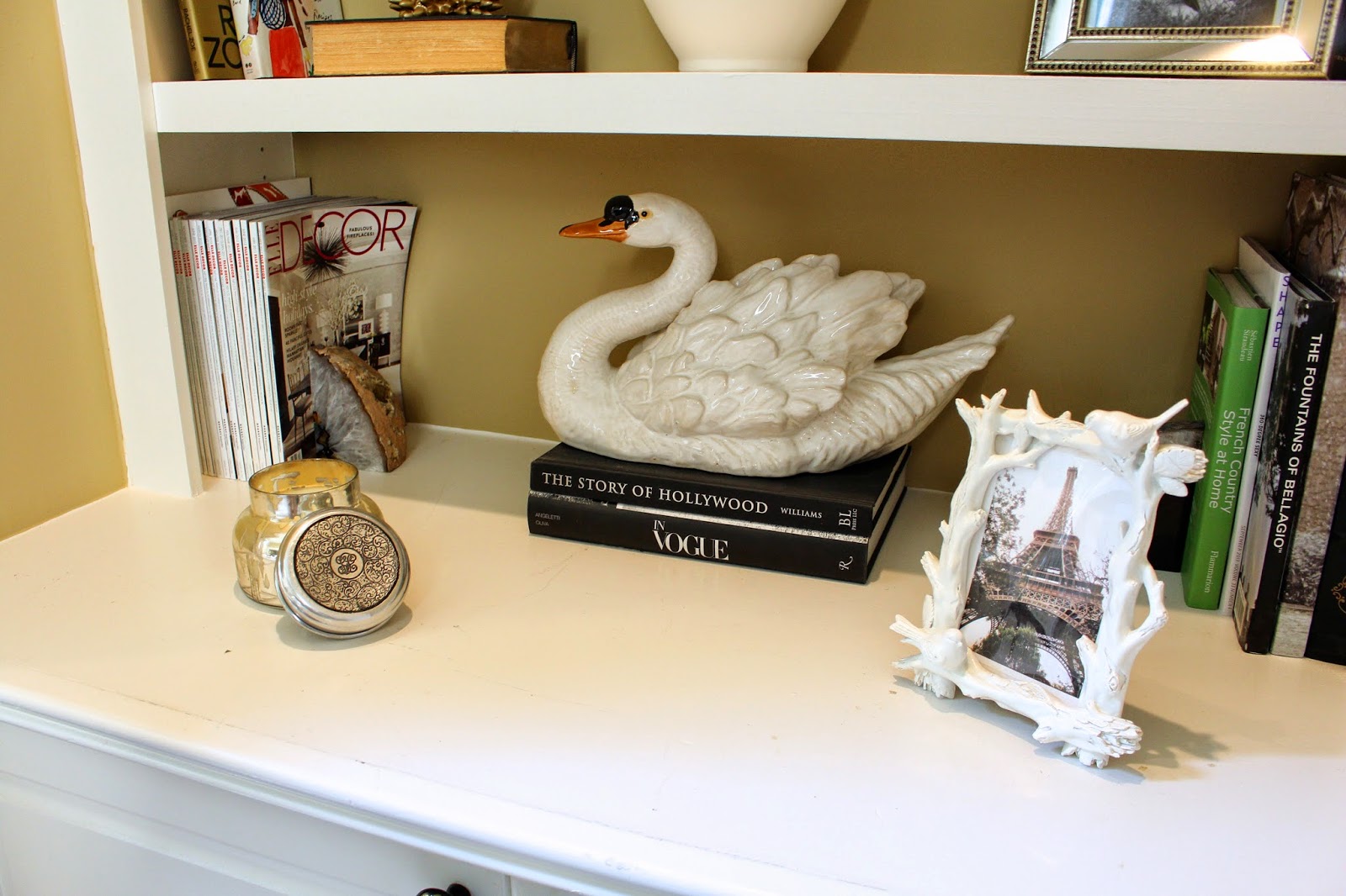
- Start with your books, then add a "collection" of similar items. For me, it's white ceramic things. I've had all of these items forever and while they're all different, the similar color and material help to pull the entire shelving area together when scattered about.
- Go heavier on the bottom shelf and lighter on the top. To me, it just visually feels right and gives you more to look at and actually be able to grab from on a more accessible shelf. For us, this works out perfectly also because the bottom shelf is a bit deeper and holds more stuff. Use some trays in this space to group lots of smaller items together without feeling cluttered.
- Don't just arrange books vertically, arrange some horizontally as well with some items grouped on top of them. This works really well to display tinier items as well.
- Mix in some photos and some "sparkle". I added some gold and mirrored items to ours. Even if you don't want anything super "bling-y" or crazy, adding something metal works well to add some different finishes.
- Don't make every shelf look the same. Stagger items, group things by twos or threes, and add items of different colors and types to sort of balance everything out.
- If you have a favorite magazine, save the issues and display them behind a bookend to add some more reading material to the actual shelf. I love to collect Elle Decor.
- Remember that you can't really make any major mistakes. Just play around with the items and keep stepping back to see if it "feels" right. Sometimes I find it helpful to snap a few photos with my iPhone and look at it that way. For some reason, I can always see more things I don't like or that feel unbalanced from a photo.
Ours definitely aren't perfect, but I always smile when I look at them, which I think is a good sign. I like that they are definitely "arranged" and feel put-together, but still feel inviting enough to actually grab books from and look through when you want something to read.
So those are just the tips that work for me. Maybe they'll help you if you're stumped with your shelves or just feel like they're never "just right". Part of feeling "just right" for me is not being so perfect. Flip some books around, lean them in different directions... just have fun with it. That's what shelves are to me anyway... A fun place to display your favorite things.
So do any of you struggle with your shelves? What types of things/collections do you display on yours??
.jpeg)
.jpg)


No comments:
Post a Comment